
Understanding Colour Schemes in Historic British Homes

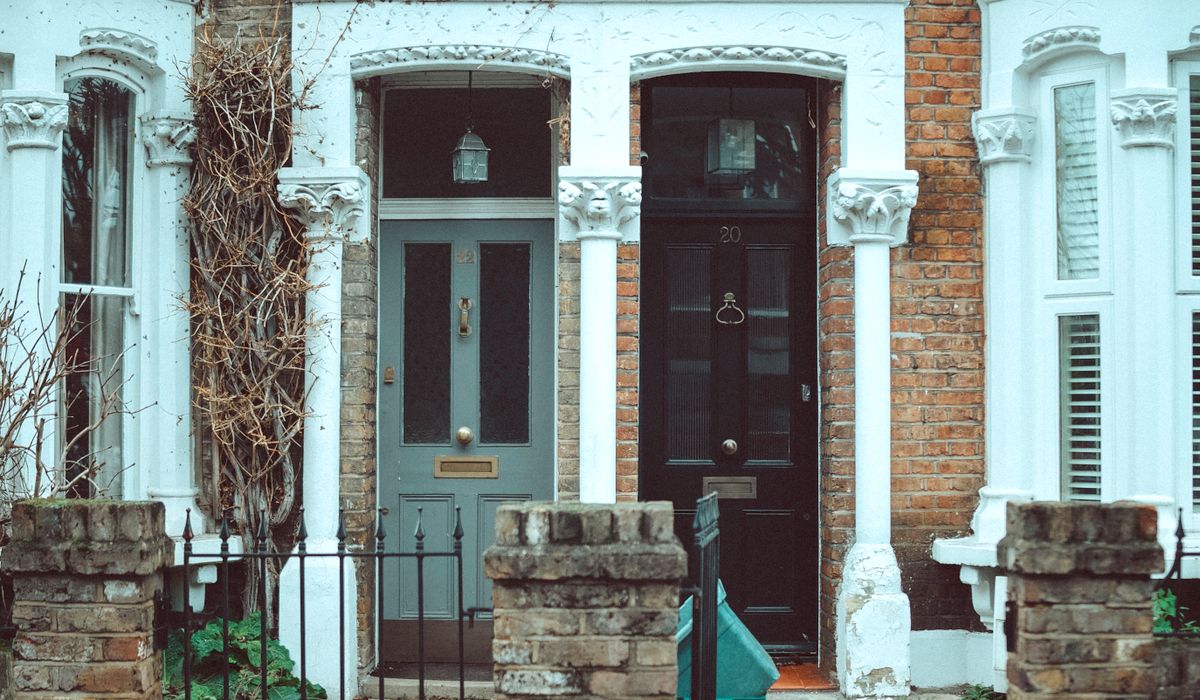
The Myth of the Plain Historic Home
It is tempting to imagine that historic British homes were decorated in restrained creams, off-whites and soft greys. That picture owes more to twentieth-century taste than to the past. Paint analysis repeatedly shows that Georgian, Victorian and Edwardian homeowners used far stronger colours than we expect, often in modest terraced houses as well as grand country properties. A small parlour might have been painted in deep olive, a bedroom in rose pink, a hall in stone or ochre. Stencilled borders, grained doors and layered schemes turned ordinary rooms into expressive domestic spaces.
What Paint Analysis Reveals
Paint analysis is part archaeology, part chemistry. A conservator takes tiny samples from skirting boards, cornices, window reveals or door edges, mounts them in resin and examines the cross-section under a microscope. Each layer tells a story: a first coat of distemper, a later oil paint, a stencil, a varnish, a twentieth-century emulsion. Pigment identification can show whether a colour came from earth ochres, lead white, Prussian blue or chrome yellow. The sequence matters as much as the colour itself.
- Earth pigments: ochre, umber, red oxide and raw sienna gave warm, stable colours that were widely affordable.
- Bright synthetics: Prussian blue, chrome yellow and vermilion allowed stronger, cleaner tones from the eighteenth century onwards.
- Problem greens: copper arsenic greens, including Scheele’s green, were popular but unstable and toxic, so later decorators often overpainted them.
- Binders and finishes: distemper, limewash, linseed oil paint and size-based colours all leave different signatures in the layers.
The lesson is that even service rooms, passages and back bedrooms were frequently coloured. Plain white was rarely the default; it was often a later correction.
Georgian and Regency Confidence
Georgian interiors could be surprisingly rich. Exterior stucco was often painted stone or cream, but inside, dining rooms and parlours might be crimson, olive, chocolate or a deep Prussian blue. Drawing rooms favoured pea green, rose pink, straw and pale blue, with ceilings in white or a tinted off-white. Woodwork was sometimes picked out in a contrasting colour, though doors were also grained to imitate mahogany or oak. Dado rails and chair rails helped divide walls into sections, each with its own tone.
Regency schemes became bolder and more theatrical. French grey, lilac, bronze green and strong yellows appear in paint analysis, often with gilded details or stencilled ornament. The aim was not uniform calm but contrast: pale ceilings, mid-toned walls and darker woodwork, with colour used to shape a room’s proportions and mood.
Victorian Layering and Stencilling
Victorian decorators frequently worked to a three-colour discipline: a pale ceiling, a mid-toned wall and darker woodwork or dado. But within that framework, colour could be intense. Terracotta, peacock blue, magenta, deep red and olive green were all used, especially after aniline dyes expanded the palette. Stencilling was common in both grand and modest homes. A frieze of repeated motifs, a stencilled dado or a border around a chimney breast could transform a plain plaster wall at little cost.
Gothic Revival and Arts and Crafts designers encouraged patterned surfaces, hand-painted details and repeating geometric or botanical stencils. In a small terrace, a stencilled hall or parlour was a way of asserting taste and character. Later Victorian schemes often became denser, with layered patterns, textured wallpapers and strongly coloured joinery.
Reading Your Own Historic Scheme
Before reaching for a modern paint chart, investigate what your house once wore. Look in less visible places: inside cupboards, under floorboards, behind skirting boards, along window reveals and on the edges of doors. Paint scrapes taken carefully with a scalpel can reveal earlier layers. Photograph them in daylight, and record the sequence rather than assuming the first colour you see is the original.
- Check several rooms and different surfaces, as schemes often varied by function.
- Look for stencil fragments under later emulsion or lining paper.
- Note whether the finish was flat, chalky distemper or a glossier oil paint.
- Test patches on large boards before committing to a full room.
Original finishes were usually flat or low-sheen. Vinyl silk and modern acrylics can look wrong in a historic interior and may trap moisture in older walls.
Bringing Historic Colour Back Sensitively
Use paint analysis as a guide, not a straitjacket. If the exact pigment is unavailable, match the tone and depth rather than the brand. Consider how light moves through the room: a north-facing parlour may carry a deep olive or slate blue, while a bright south-facing bedroom can take rose pink or soft yellow. Breathable paints such as distemper, limewash and linseed oil paint are usually the safest choice for old plaster and joinery. They allow walls to dry out and age gracefully.
Layering is part of the character. A historically informed scheme might include a pale ceiling, a mid-toned wall, a darker dado and a stencilled border, all in colours that sit comfortably together. Sample boards should be viewed at different times of day. Live with them for a week before deciding. The result need not be a museum reconstruction; it should feel warm, grounded and appropriate to the house. Historic British homes were never simply plain, and their colour stories are still waiting to be read.

Joeby Ragpa
This template is so awesome. I didn’t expect so many features inside. E-commerce pages are very useful, you can launch your online store in few seconds. I will rate 5 stars.
ReplyAlexander Samokhin
This template is so awesome. I didn’t expect so many features inside. E-commerce pages are very useful, you can launch your online store in few seconds. I will rate 5 stars.
ReplyChris Root
This template is so awesome. I didn’t expect so many features inside. E-commerce pages are very useful, you can launch your online store in few seconds. I will rate 5 stars.
Reply